Product Designer
Duration
Team
Platform
Tools
Overview
This project aims to improve the user experience of the City of Toronto's website, particularly focusing on enhancing navigation, accessibility, and mobile optimization, to increase community engagement with city services.
The Problem
This case study addresses Toronto City's website challenges, focusing on improving the recreation booking system's usability, especially on mobile devices, to better serve users' needs.
01
Mobile Incompatibility
Responsive design is missing, limiting access on different devices.
02
Inefficient Navigation
The site’s navigation makes finding recreational services difficult.
03
Complex Booking
The website's cumbersome booking system complicates program registration.
The solution
The project's solutions center on a redesign aimed at significantly improving user-friendliness and ensuring the system is fully responsive on mobile devices, making it easier and more efficient for users to navigate and interact with the platform.
01
Mobile-First Approach
Optimize the website for mobile with responsive design to ensure smooth functionality and ease of use on all screen sizes.
02
Simplified Menu
Refine site structure and navigation with user-informed clear menus and labels.
03
Streamlined Process
Simplify the booking process with fewer steps, clear availability display, and smart forms for quick completion.
The goal
The goal is to provide a more intuitive, efficient, and mobile-friendly booking experience,allowing straightforward access to the City of Toronto's recreation services.
User research
Many users have expressed their dissatisfaction and frustration with the overall user experience provided by the City of Toronto's website, mentioning problems like hard-to-follow menus, confusing layouts, and trouble finding the information they need, making it hard for them to use the city's online services easily.
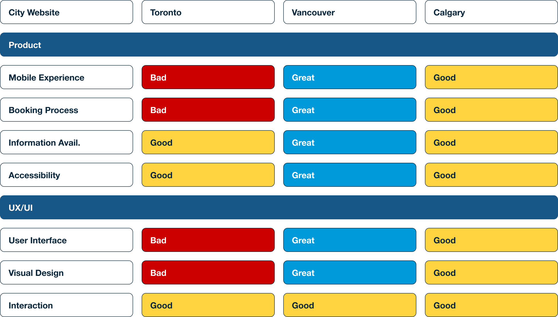
I selected the Vancouver City Website and the Calgary City Website as competitors to compare with the Toronto City Website.
I received 21 responses for the survey, which consisted of 12 questions in total.
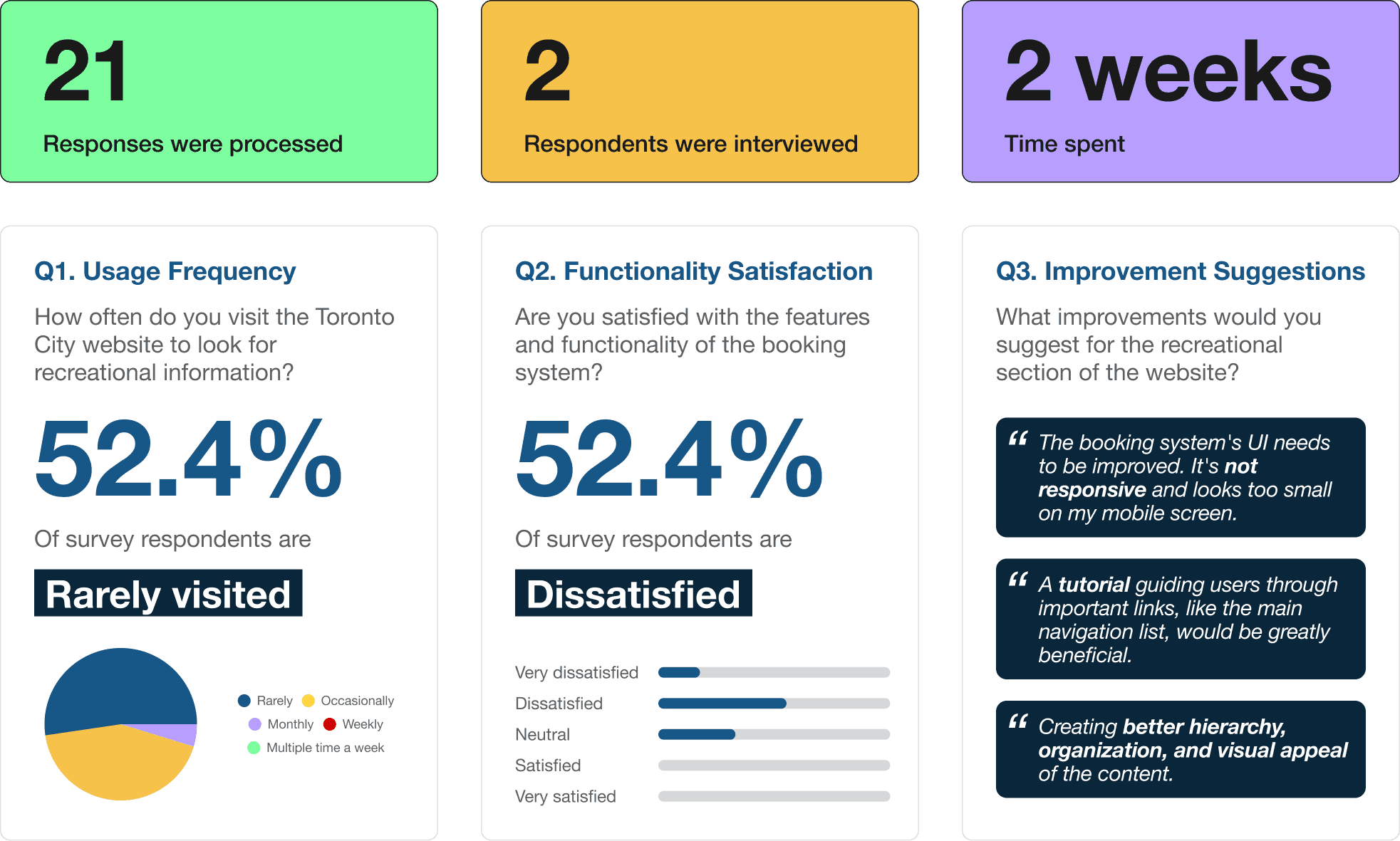
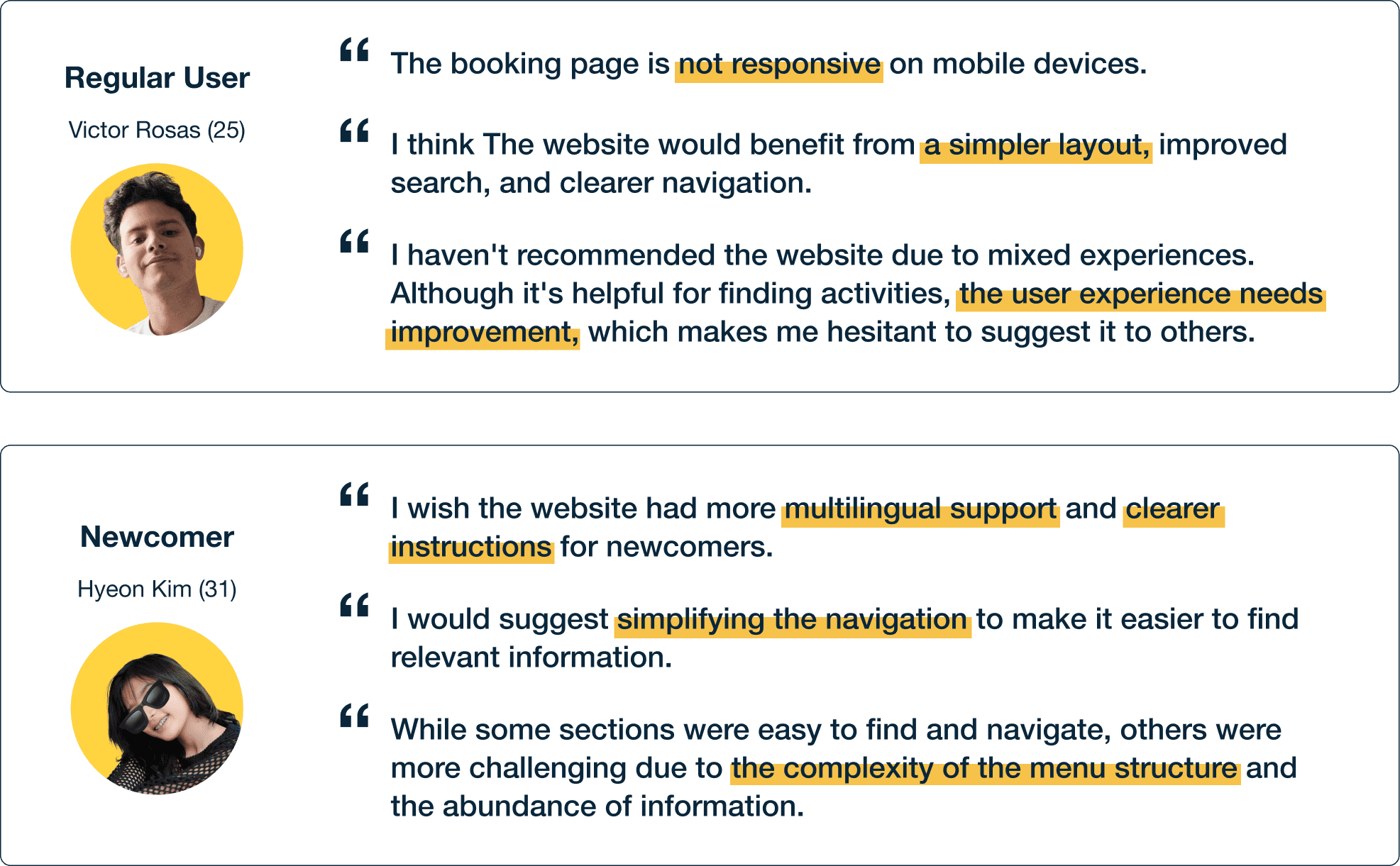
I also conducted two in-depth interviews: one with a person who frequently visits the Toronto City Website and another with someone who has recently moved to Toronto and is new to using the city's online resources.
define
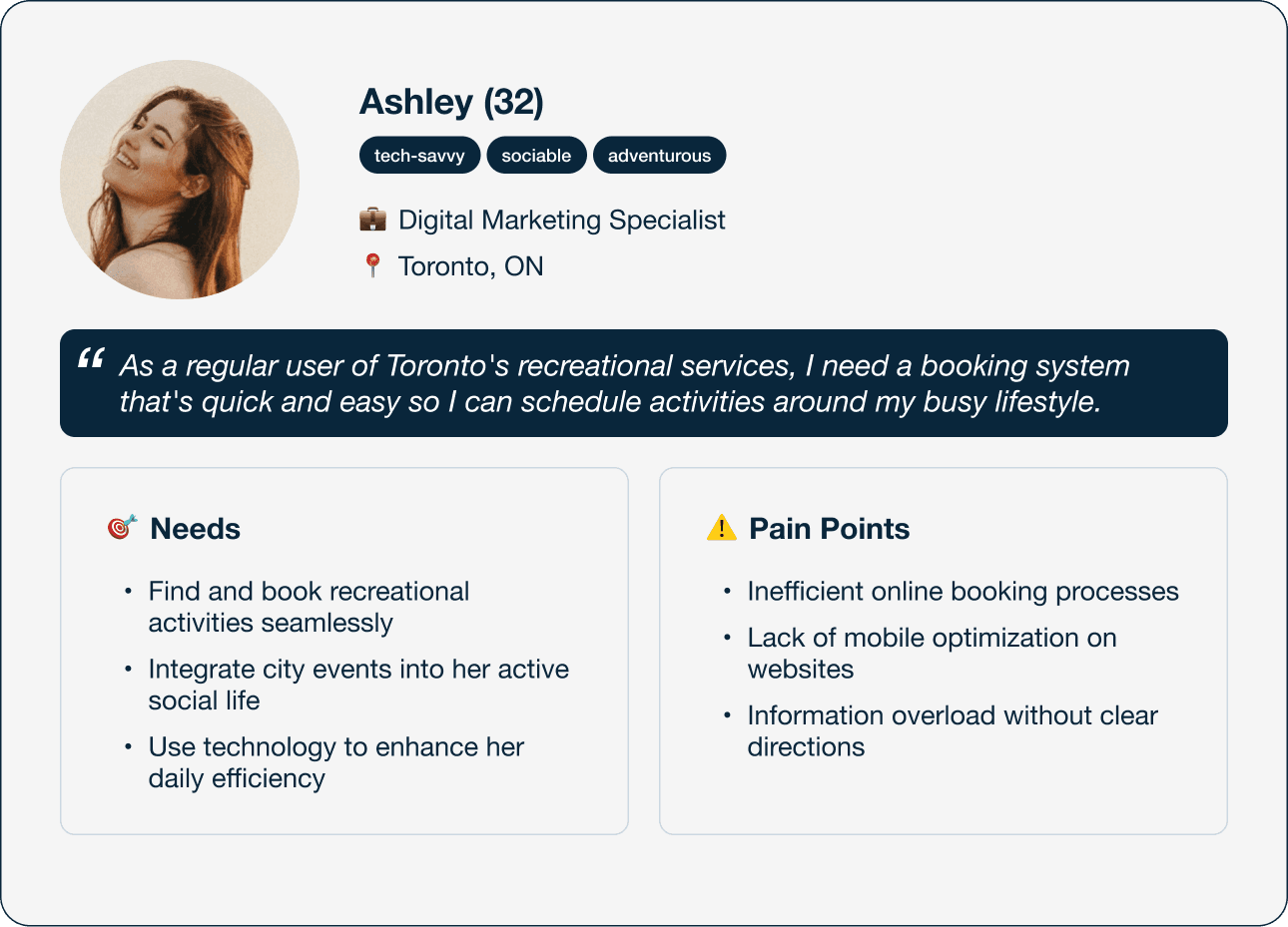
Based on the research, I was able to create a regular user persona within the targeted group. The persona and the empathy map helped me to empathize with the users.
define
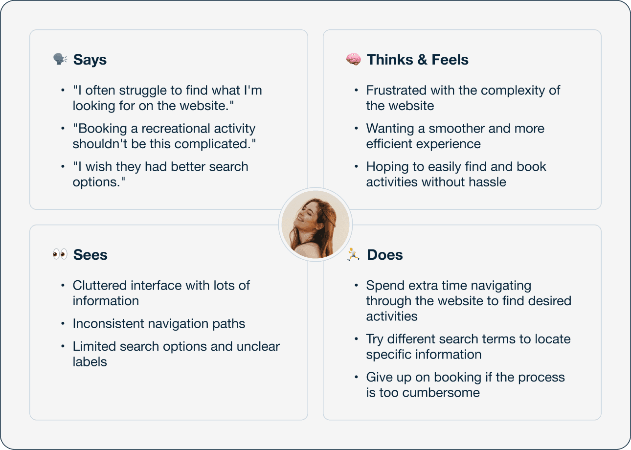
I developed an empathy map from the persona to better understand user needs, aiming to use these insights for designing a more user-focused online booking service.
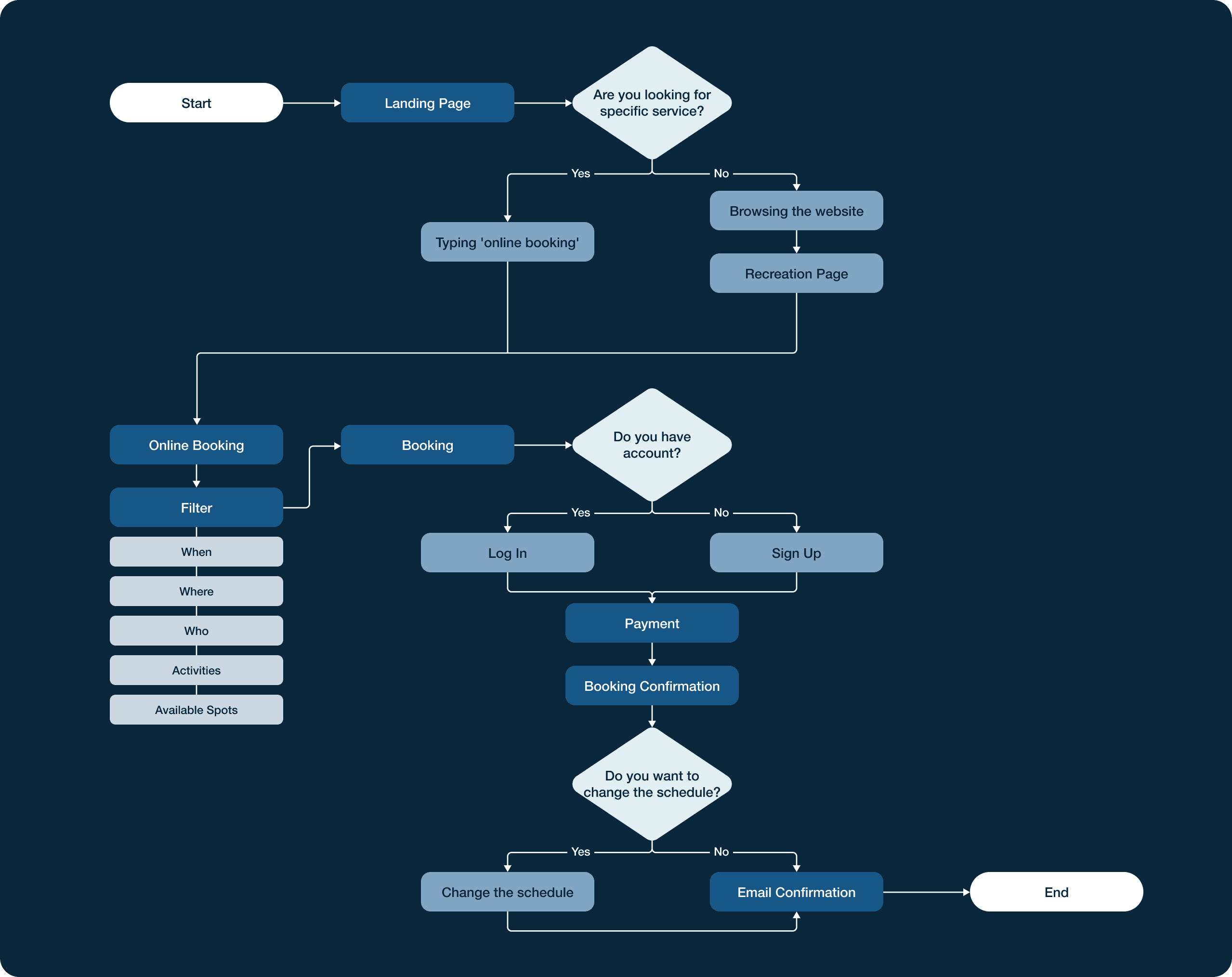
Ideate
This user flow outlines the detailed steps a user needs to take in order to find and book an activity, which is the core task of this project. It enables me to integrate the features together and also provides a guide for the information architecture.
define
This user journey shows Ashely’s process of booking a picnic spot with fire pits on the Toronto City website. It allowed me to pinpoint opportunities for design improvements at crucial moments.

define
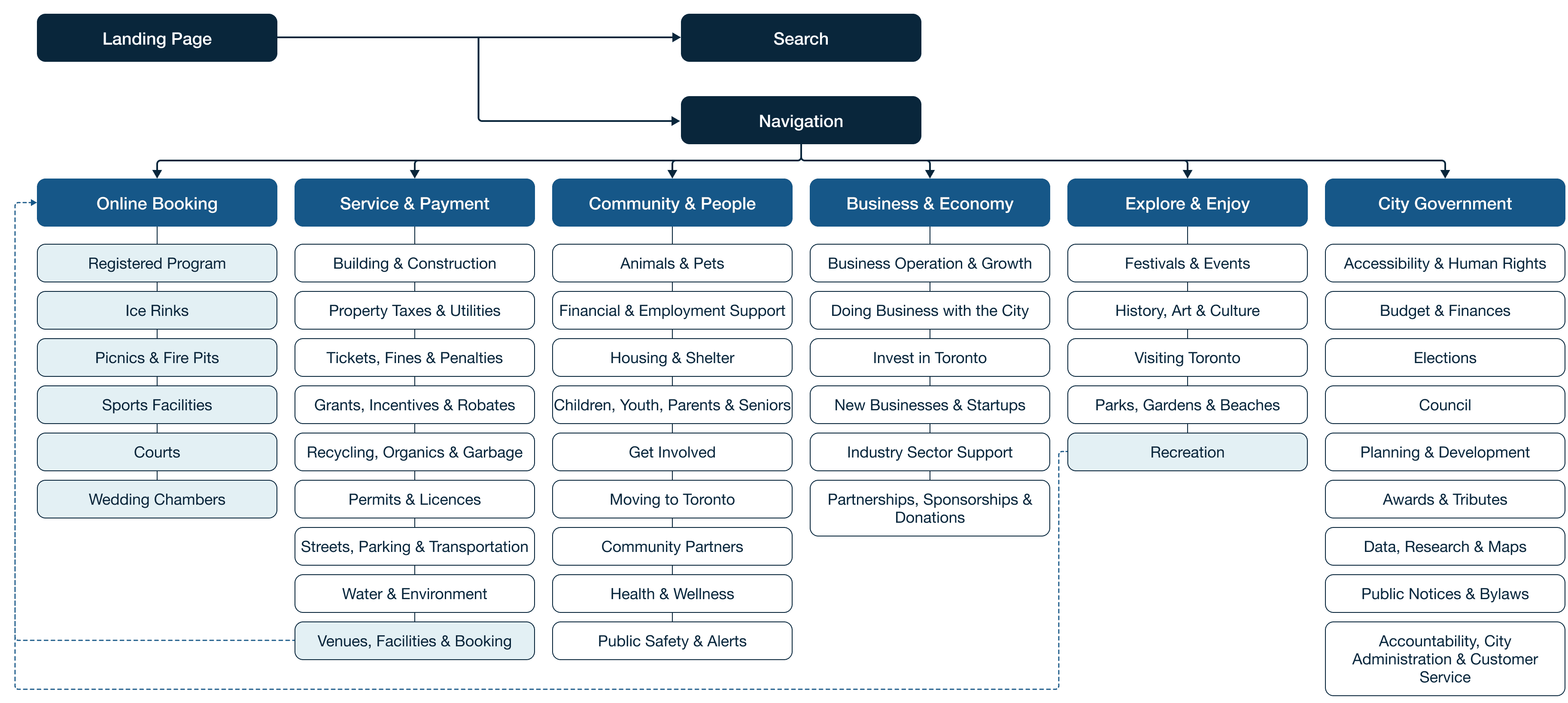
I have restructured the information architecture by adding an online booking section and grouping services for easier navigation and booking.
prototype
I focused on a mobile-first approach to make the screens easier for mobile users to access online booking pages, addressing the current system's lack of mobile-friendliness. I started with quick hand-drawn sketches and then created more detailed wireframes.
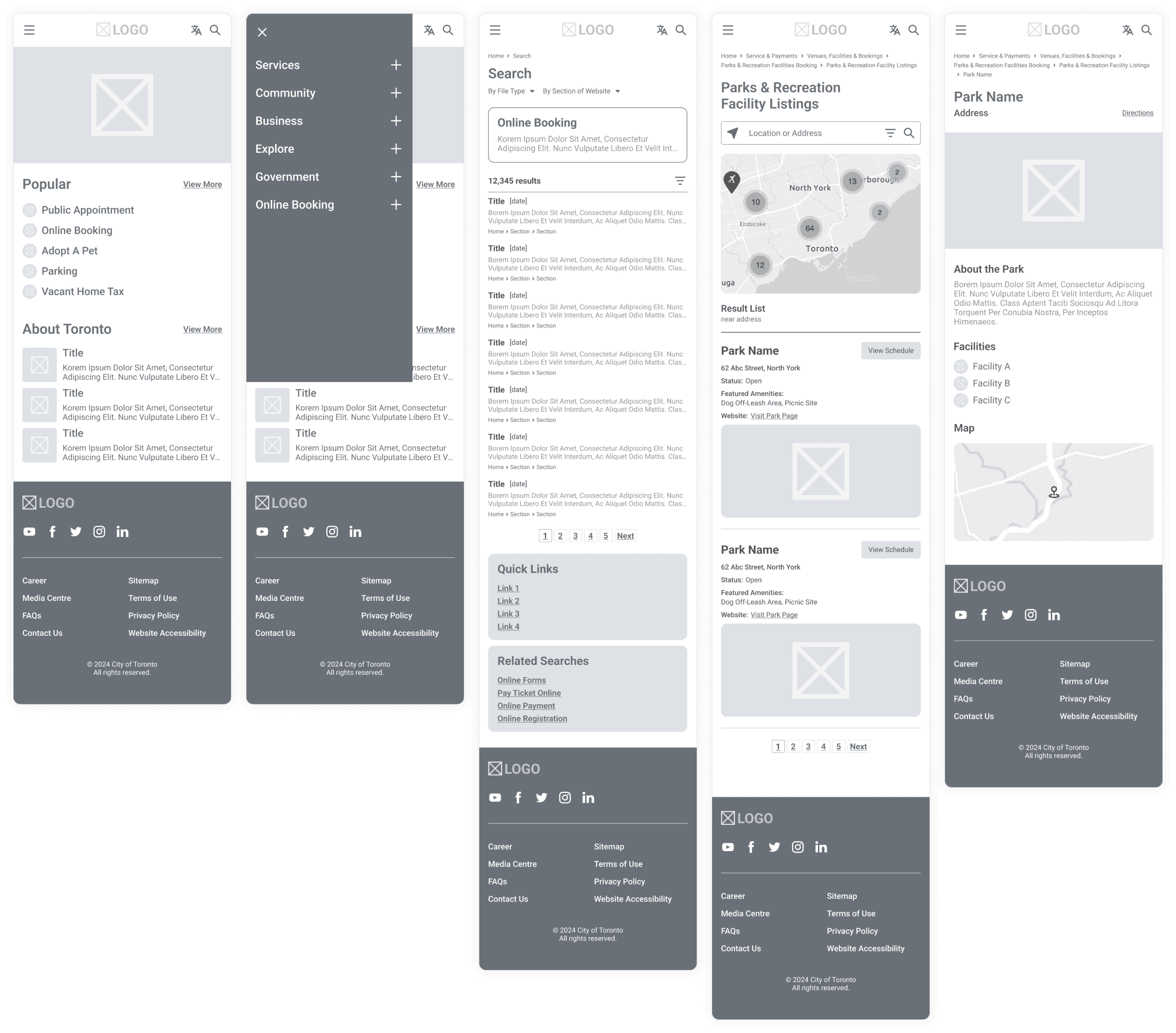
prototype
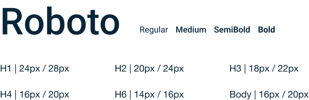
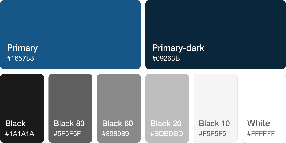
I followed Toronto's design guidelines for colours and fonts, and I built a mobile-focused typography system.
prototype
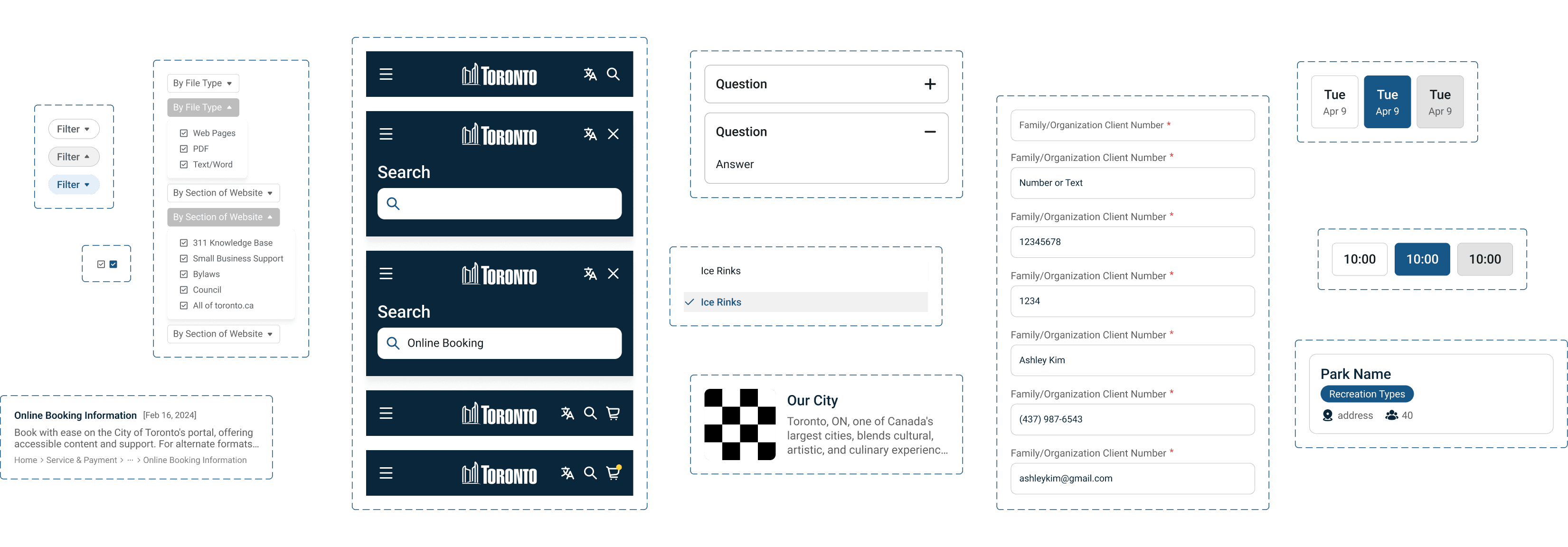
I designed UI components to enable efficient and intuitive interaction, ensuring that users can navigate and perform tasks seamlessly.
Testing & Iterations
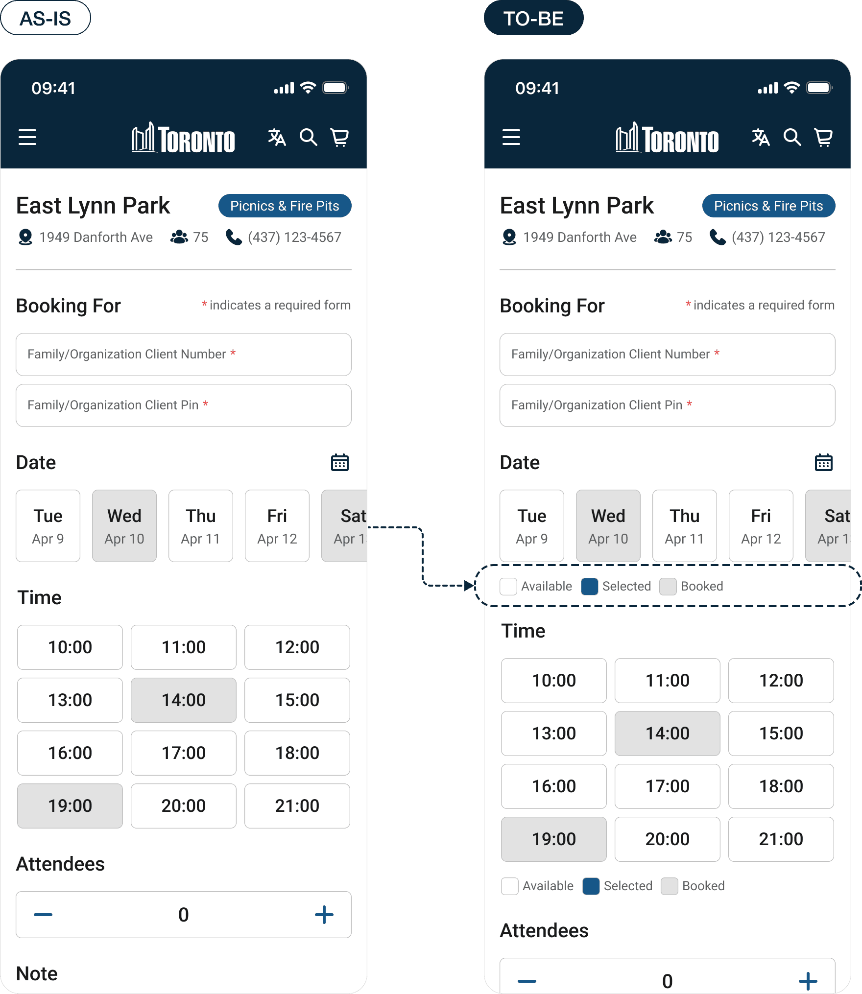
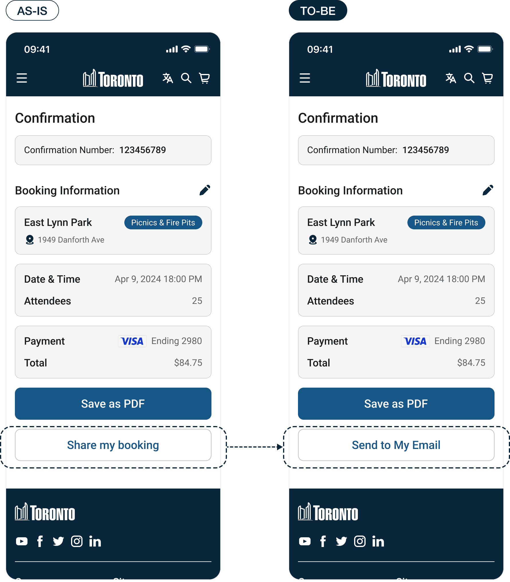
I tested the usability with two users and got feedback that quick links aren't easily accessible, available time slots are hard to spot, there's confusion about the asterisk indicating required fields, and a suggestion to change the CTA.
Users found quick links on the booking page to be difficult to navigate.
Difficulty in identifying available time slots during the booking process.
Users suggested changing the call-to-action button to "Send to My Email" for better understanding.
Testing & Iterations
Quick Link Accessibility
Quick link navigation poses a challenge for users, signaling a need for a more user-friendly design.
Slot Identification
Identifying available time slots proves difficult for users, highlighting the necessity for a clearer presentation of options.
CTA Optimization
A call for a clearer call-to-action suggests 'Send to My Email' as a user-preferred choice for simplicity.
Testing & Iterations
I conducted an eye-tracking test with Clueify to assess how users visually interact with the interface to identify patterns and improve user experience.

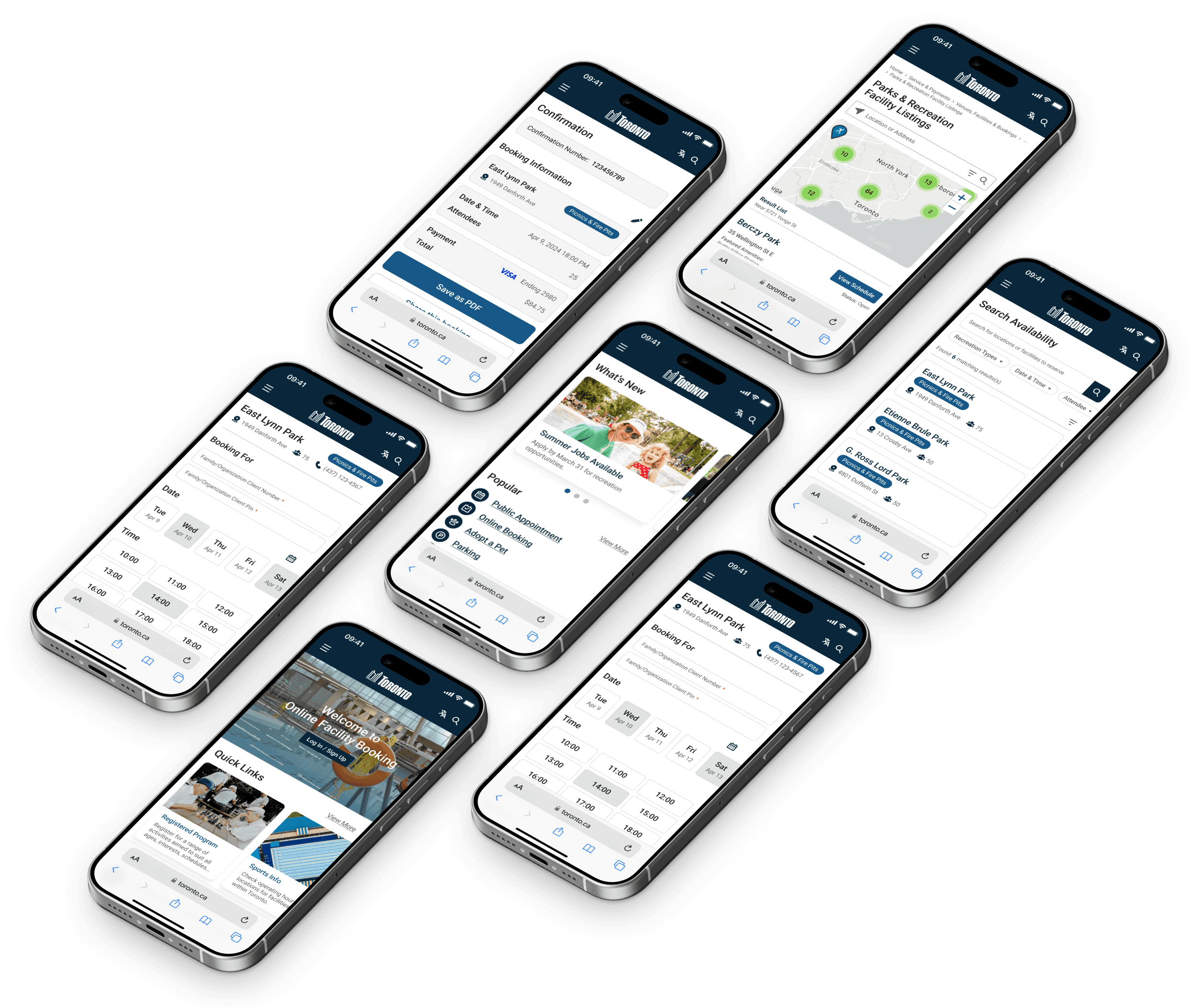
Design solution
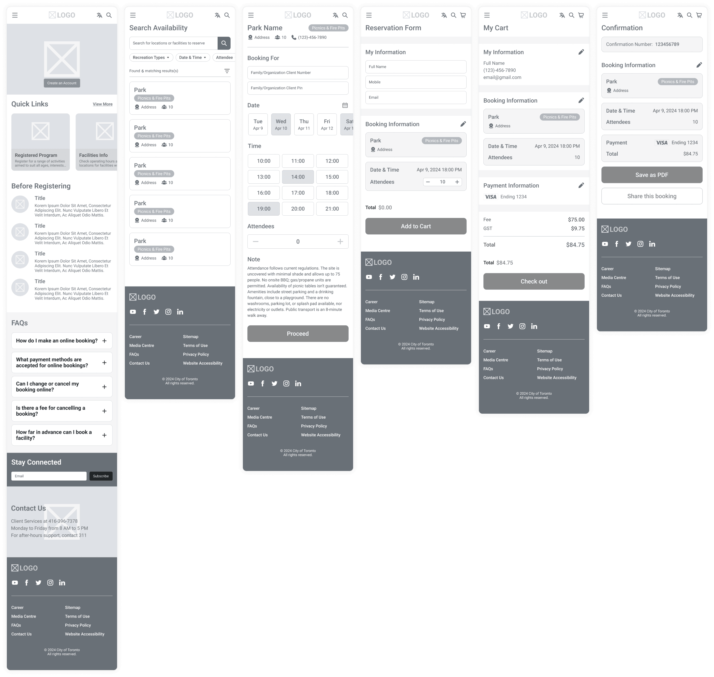
I have developed the final design using my wireframes and a defined design system to ensure a consistent and user-friendly interface design.


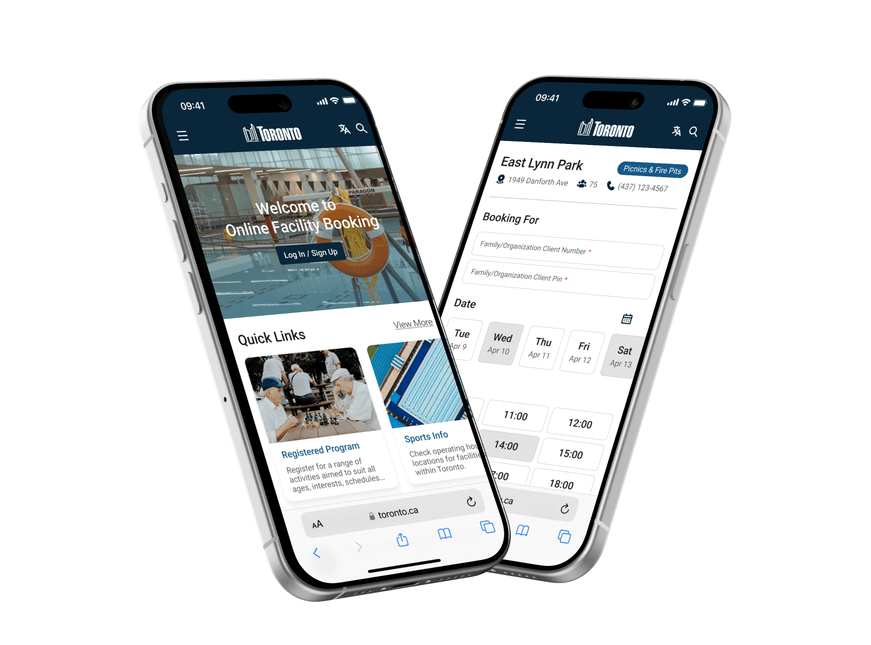
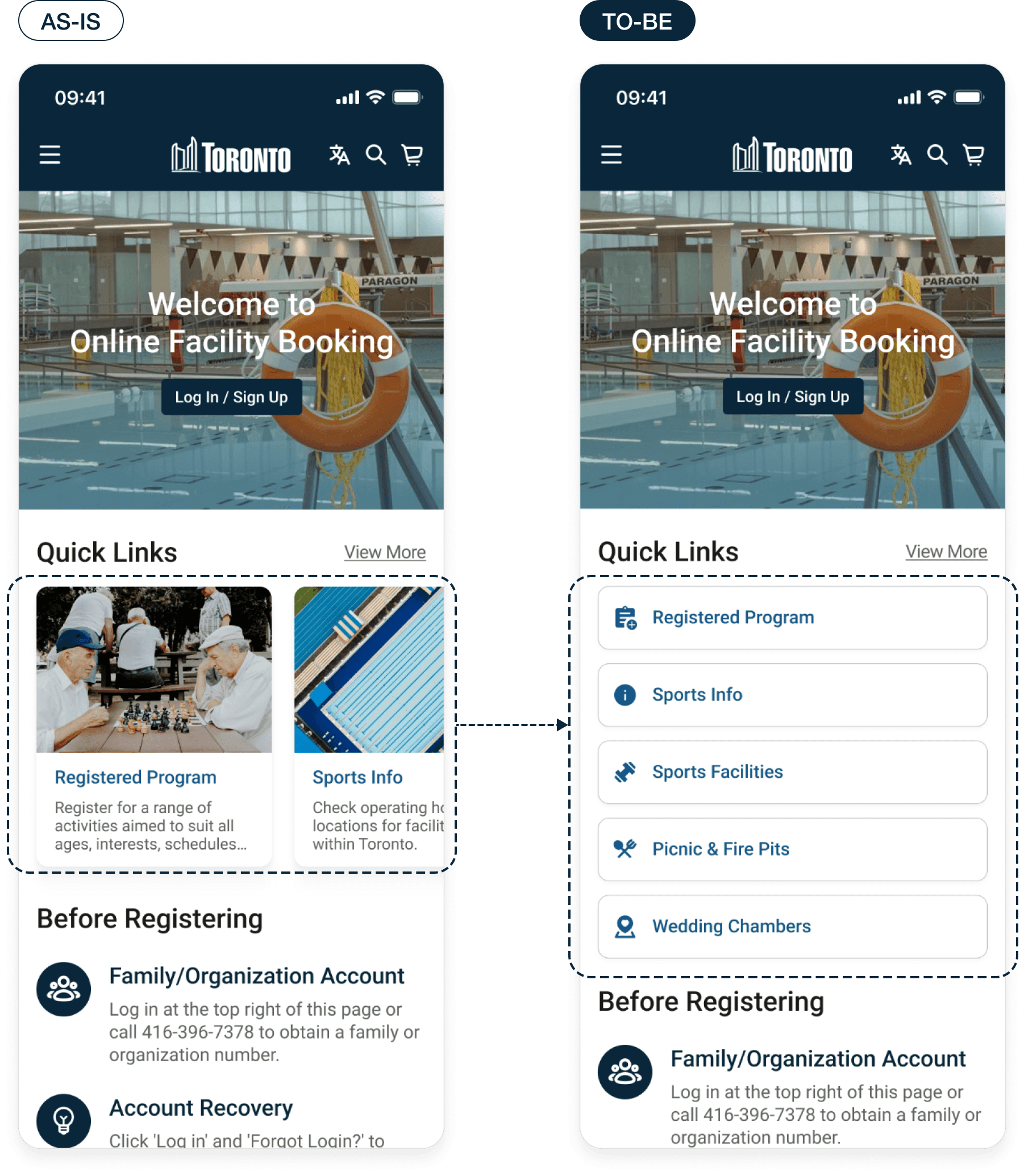
I designed a responsive online booking page for mobile users and created screens to access the booking process easily.

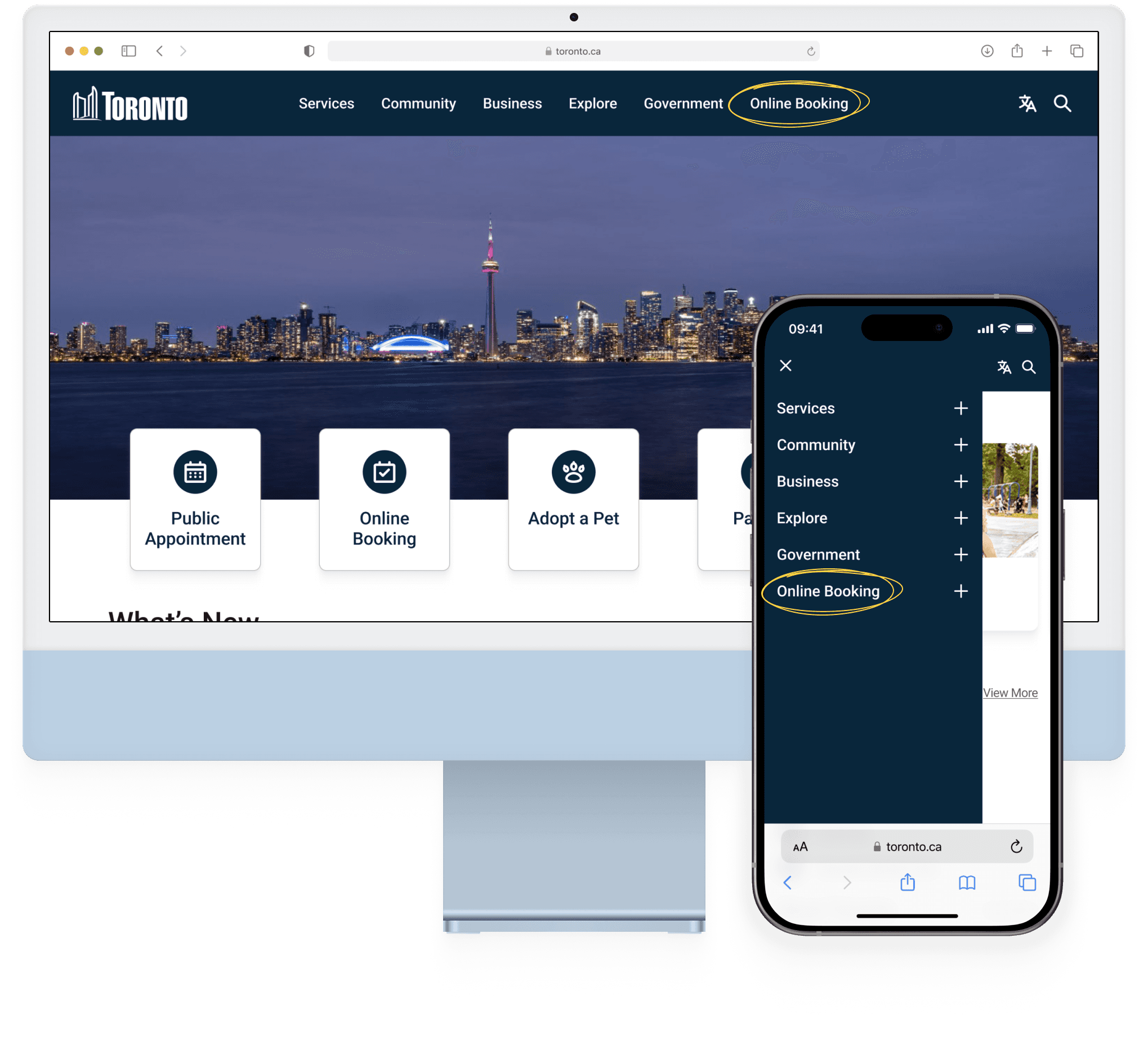
I added an 'Online Booking' tab to the main navigation menu to provide direct and easy access.
I made the process more user-friendly by adding a search with filters, options to choose specific dates and times, a reservation form, and a checkout procedure that ends with an email confirmation for the user.
Reflections
I started as a typical user of the City of Toronto’s website, which presented unique challenges. I had to consciously keep a professional distance to prevent personal biases from influencing the research process. This objective stance was essential as I tackled the complexities of crafting a responsive website, highlighting the significance of an unbiased perspective in user experience design.
01
Professional Distance
During the design process, I was careful to set aside my own experiences as a user and focus on the diverse needs of all users. This meant making decisions that weren’t just based on what I liked, but what would be best for everyone using the website, keeping a clear boundary between my personal views and my professional duties.
02
Responsive Design
The aim was to create a website that automatically adjusts to fit the screen it's viewed on, whether that's a phone, tablet, or computer. I put in extra effort to ensure that every feature would be just as easy to use on a small phone screen as on a large desktop display, considering the different ways users might interact with the site.